Illustrator Inspiration: Mickey Duzyj
2/25/2022
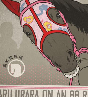
Mickey’s work is a great example of how to breathe fresh new life into an older aesthetic. But his true talent is really his eye for composition — how he creates these beautiful, layered, and complex (yet incredibly cohesive) illustrations. His use of typography, texture, negative space and darkness (especially in the Seat Geek work) is really elegant. Everything is just on point. It’s the type of work that makes you think, “Wow, I need to step my game up.” And maybe most importantly: it’s just fun. I enjoy looking at this work. And that’s what good creative work is supposed to do — make you feel something.
~ Connor Mitchell, Art Director
Images: Mickey Duzyj | See more: http://www.mduzyj.com/
View this post on Instagram
View this post on Instagram
View this post on Instagram
View this post on Instagram
View this post on Instagram


