One year of The ’Gist
5/15/2024
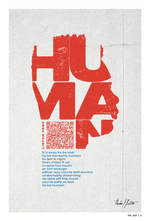
Just over a year ago, we decided to make a quarterly zine: an internal publication, printed on paper, created and edited by Ologists, for Ologists. Everyone across the company, both full-time creatives and folks who work in other areas, was invited to participate in the project, which we called The ‘Gist. (The name is a nod to “Ologist,” but we also liked the implications of the word on its own.)
In the age of hybrid work, The ‘Gist gave us an outlet to be freely artistic outside of what we make for clients — to celebrate creativity in all its forms, to make simply for the joy of making, and to write our own definitions of what creativity is for each of us individually.
Four editions later, we’re looking back on the first year of our creative zine and marveling at the talent, creativity, and collaboration of our amazing team.
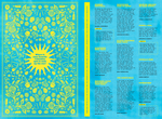
Each issue had its own theme — Sun, Mask, Quiet, Bloom — and we urged contributors to interpret the theme as literally or inventively as they saw fit. We received traditional submissions like illustrations, photos, essays, poems, and comics, but also unique digital experiences, augmented reality, mini-games, and even horoscope readings. We created a Slack channel to provide inspiration and promote collaboration, and each issue had a new cohort of editors overseeing its development. At the end of each submission cycle, physical copies of each edition were distributed company-wide, either by hand or via snail mail.
One of the brains behind the project, Eric Blair, said, “Inclusivity is the key here. We want to keep it loose, we want to keep it fun, and just celebrate making things.”
We asked a few Ologists about their favorite features from the first four editions — check out their responses below.
“There was a spread in the first edition that I loved with fun places to check out in Columbus for the summer. Even though I don’t live there anymore, I love a good list of places to try in a city, and I saved so many places for my next visit!” — Abby Zimmerman, Senior Digital Strategist
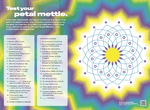
“My favorite thing has been developing custom word puzzles for the last couple issues. It’s been really fun to interpret each issue’s theme to come up with a unique puzzle, and it scratches a creative itch that I don’t get satisfied elsewhere. And then having Ologie’s designers transform my creation into something that’s visually stunning is an added delight.” — Joel Showalter, Editorial Director
“My favorite was Lizzy’s piece about pregnancy. I adore when moms and birthing people get real and vulnerable about their experiences. It’s like a little crack in the facade we’ve seen portrayed for far too long. It allowed a little light to shine through for all of us.” — Rachel Sharkman, Associate Strategy Director
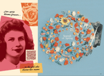
“If I had to pick my favorite spread, it would be pages 22-23 of ‘Bloom.’ Katie Anthony-Brown’s song, in combo with Fletcher’s floral display, is so gorgeous. My husband looks forward to each edition too! As a fellow comic book artist, he enjoys keeping up with the adventures of Space-Steve by Mark Love.” — Amanda Caskey, Senior Designer
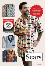
“I love experiencing moving poetry written by account managers, artwork from strategists, choreography from researchers, handmade clothing from the film team (pictured below), and more — part of the magic of The ‘Gist is that it reminds us creativity lives in every corner of Ologie, not just the traditional creative teams. It’s inspiring, and keeps me in awe of the people I work with every day.” — Audrey Ward, Art Director, Copy
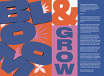
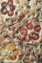
“I have submitted to every issue of The ‘Gist and have helped design other Ologists’ submissions! Some of my favorite submissions I’ve done were for the fourth issue, ‘Bloom.’ They took my design and made it the cover, and it also was used for the design language for the Bloomcast (a one-time-only live-stream event in the ‘Bloom’ Room at Ologie HQ). I also submitted a picture of focaccia I made that had some tomatoes arranged like a flower. This theme inspired me to try something new, it was the first bread I’ve ever made!” — Sarah Martin, Senior Designer
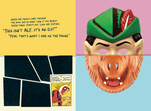
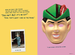
“My two favorite submissions from the past issues are both from the ‘Mask’ edition — the cover and ‘The Alf/Elf Debacle of ‘88.’ The cover is freaking brilliant. Up close, it just looks like a halftone pattern. Not until the piece is far away does it reveal the image. So incredibly ingenious while also so simple. I leave it out on my coffee table, and guests just love it. ‘The Alf/Elf Debacle’ made me laugh out loud real hard. Not only was the content funny, but the idea of designing a piece that requires the page to be cut… come on. Brilliant. Eric’s brain just works differently. He thinks of the way a person will interact with his work first; this is one of the many reasons why he’s one of our strongest designers.” — Taylor King, Creative Director
“I loved Eric’s piece in the ‘Mask’ issue — the one with the different masks cut in half. It was such a funny story visualized in a way that we wouldn’t usually see in client work. It was so unique and fun!” — Anasha Stevens, Senior Writer
“I’ve had the most fun teaming up with people who might not think of themselves as ‘creative’ in the traditional sense, and helping them bring their ideas to life. This zine’s all about celebrating creativity and emphasizing that there’s no right or wrong way to make something, and I love seeing everyone get excited about having their ideas show up on the page.” — Eric Blair, Art Director, Design
“Michael Belton submitted the most beautiful song to the Mask edition. I’ve always known he has the voice of an absolute angel, but seeing him share his gifts with the rest of the team was something so special. He is such a talented designer but seeing his other artistic gifts get a moment of appreciation was just the best.” — Gabby Dioniso, Digital Writer
We’ve shared sneak peeks of each issue on our social media channels, but we wanted to dive deeper here and share a fuller glimpse of the creativity our team is capable of. We hope you enjoy, and we can’t wait to share future editions with you!


