That email you’ve been working on for weeks? You’ve dotted every i and crossed every t, thought through the strategy and know your audience, approved the creative (which looks beautiful). You’ve finally set everything up and it’s ready to go. So, you send it, feeling both relieved and excited to have it out in the world.
Except, you don’t realize it, but users who have their phones set to dark mode can’t see your call to action. They completely miss the button about your upcoming application deadline. Some prospective students who were on the fence don’t apply, so your email conversions are much lower than anticipated.
Sound far-fetched? It happened to Harry Styles fans. Many missed presale access for his tour because the ticket purchase links weren’t optimized for dark mode on all devices. If it can happen to one of the biggest pop stars in the world, it can happen to any of us.
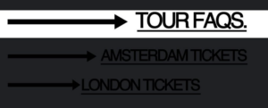
A screenshot of the Harry Styles tour email in dark mode.
Accessibility isn’t black and white.
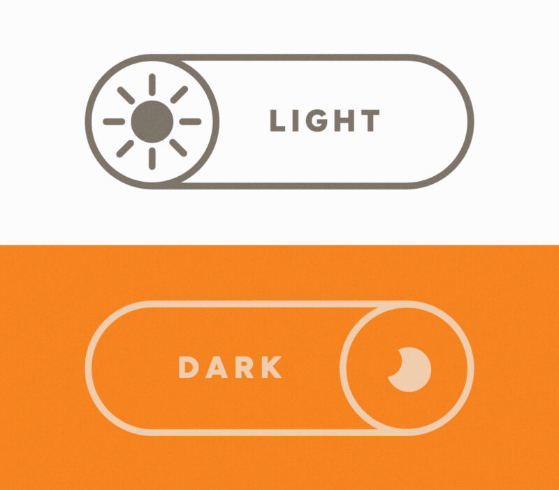
Dark mode inverts colors on your screen, and it’s been adopted by most major operating systems and social media platforms. Typically users can set either individual apps to dark mode, or their entire phone system. According to the Nielsen Norman Group, two-thirds of users use dark mode, either sometimes or all the time, showing its growing importance in shaping user experiences.
While dark mode improves accessibility for users with light sensitivity or low vision, it can also hinder readability for those with astigmatism or dyslexia. People without visual impairments use dark mode for other reasons, like aesthetic purposes or personal preference.
Accessibility is integral to usability.
This is just one example that shows how closely connected digital accessibility and user experience are. Digital accessibility is critical in providing equal access to content for all individuals. User experience aims to meet users’ needs, providing value and a positive experience as they interact with a product, system, or service. For something to be accessible, it must also be usable — but just because something is usable, it doesn’t inherently mean that it is accessible.
We all benefit from improved accessibility.
There are so many ways users may interact with or view our digital communications, and users can update their app or system settings that may affect how designs appear. When we optimize accessibility and test the user experience across a variety of devices and modes, we help ensure the best experience for everyone.
Accessibility creates digital experiences that are inclusive and equal for everyone. This email isn’t the first to have its accessibility impacted by dark mode, and it won’t be the last. We can all learn from it, and aim for maximum accessibility, and consider it early and across all phases of a project, to take a step toward a more accessible and usable digital experience.
The bottom line.
Oops moments happen to marketers all the time: The “[first name]” field doesn’t pull properly. You forget to switch out the lorem ipsum for the actual copy. Or you don’t catch a spelling error until someone does in your comments section. While we can never be 100% perfect in our marketing efforts, it’s important to add digital accessibility to your go-live checklist to ensure that your message can be read by everyone.
FAQ: Accessibility in Emails
What is dark mode and how does it affect emails?
Dark mode inverts or adjusts the colors on your screen to display light text on a dark background. Depending on the email client and device, this can cause images, buttons, and text to appear differently than intended, sometimes making key elements invisible or hard to read.
Does dark mode affect everyone’s email the same way?
No. How dark mode renders an email depends on the email client (Gmail, Apple Mail, Outlook, etc.), the device’s operating system, and how the email’s code is written. This inconsistency is why testing across multiple environments is so important.
What is digital accessibility in email marketing?
Digital accessibility in email marketing means designing emails so that all users — regardless of visual ability, device settings, or assistive technology — can read and interact with your content. This includes considerations like color contrast, alt text, font size, and dark mode compatibility.